Citi Fusion
Design System
The Business
Citibank is a global financial institution that provides consumers, corporations, and governments with a broad range of financial products and services, including consumer banking and credit, corporate and investment banking, securities brokerage, transaction services, and wealth management.
The Ask
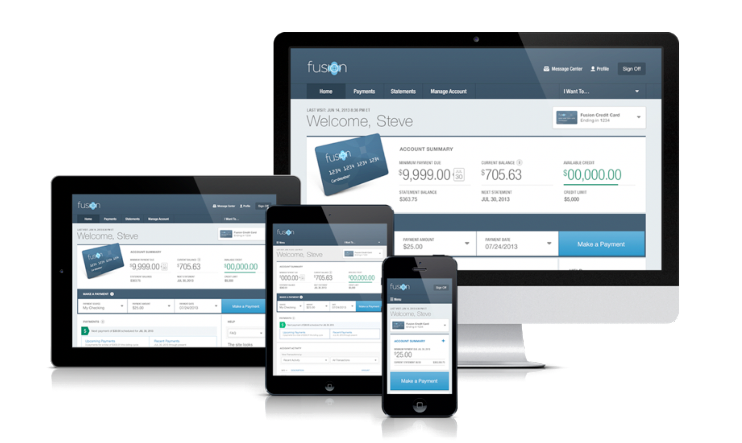
Evolve an existing browser-only look & feel system to work across all platforms and breakpoints, inside a complex ecosystem of users, and help minimize repetitive production tasks while extending the Citibank brand of service.
My Role
The design team consisted of 5 designers; an Executive Creative Director, that handled the client relationships for the overall Citi account, a Creative Director, Myself as the Design Lead, and two more junior designers. The rest of the teams consisted of a Project Manager, Lead Developer, and a revolving team of offshore developers based in the Maldives. As the Design Lead, I worked alongside the entire team to ensure the project's goals were met successfully and to the best of our abilities.
PROJECT OBJECTIVES
Best-in-class user experience
• Ease of use
• Flexibility
• Full-featured servicing
• across devices
• Personal task efficiency
PARTNER BENEFITS
Enhanced branding and marketing
• Rich marketing capabilities
• Revenue-generating enhancements
• Digitally engaged customers
• Prominent branding
• An evolving service marketing platform
CITI RETAIL SERVICES BENEFITS
Driving sales & operational efficiency
• Driving partner sales
• Speed to market
• Improved partner alignment
• Efficient customer self-service
• Sustainable cost of ownership
Opportunities
1.
Simplify navigation and provide immediate access to key content
2.
Communicate more proactively with customers about topics that matter to them
3.
Incorporate partner brand elements and content in new ways
4.
Maximize opportunities for more strategic, targeted, localized marketing
5.
Better promotion of new card features and online account management
7.
Simplify the process of adding new customers/partner cards
6.
Explore new ways to increase enrollment in Paperless and AutoPay
Foundation
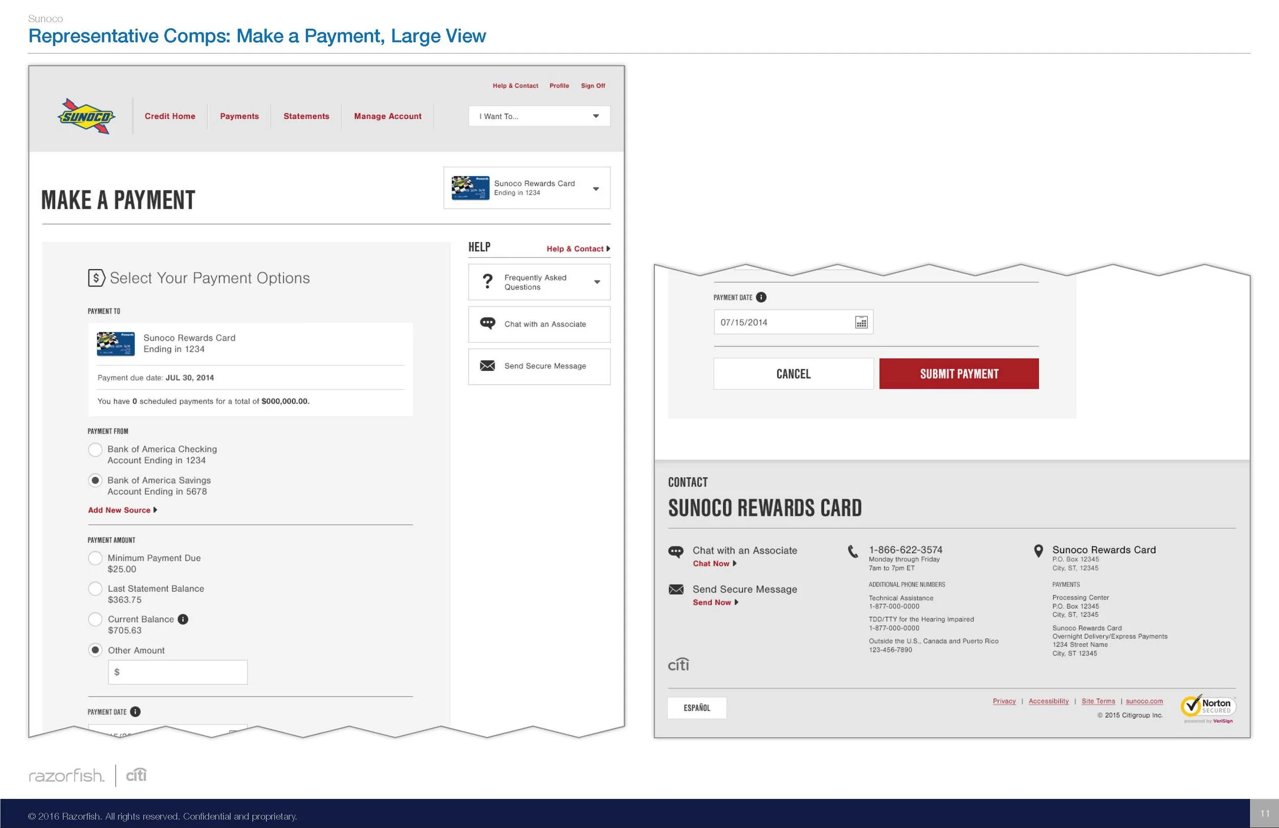
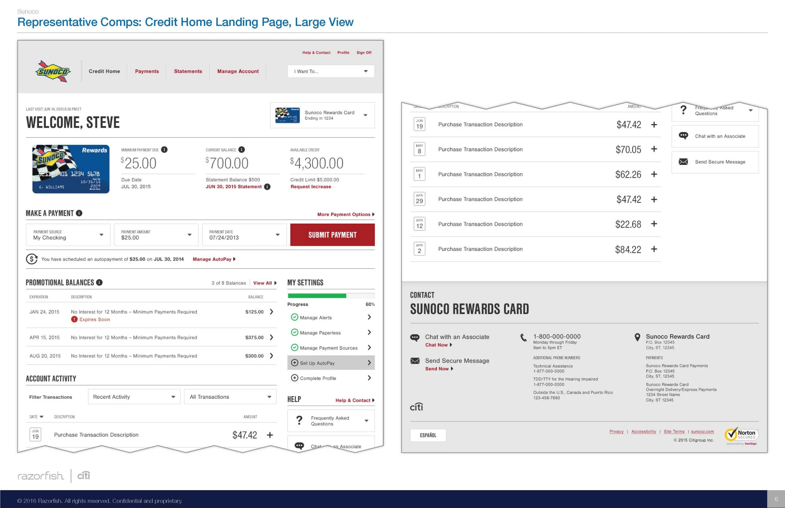
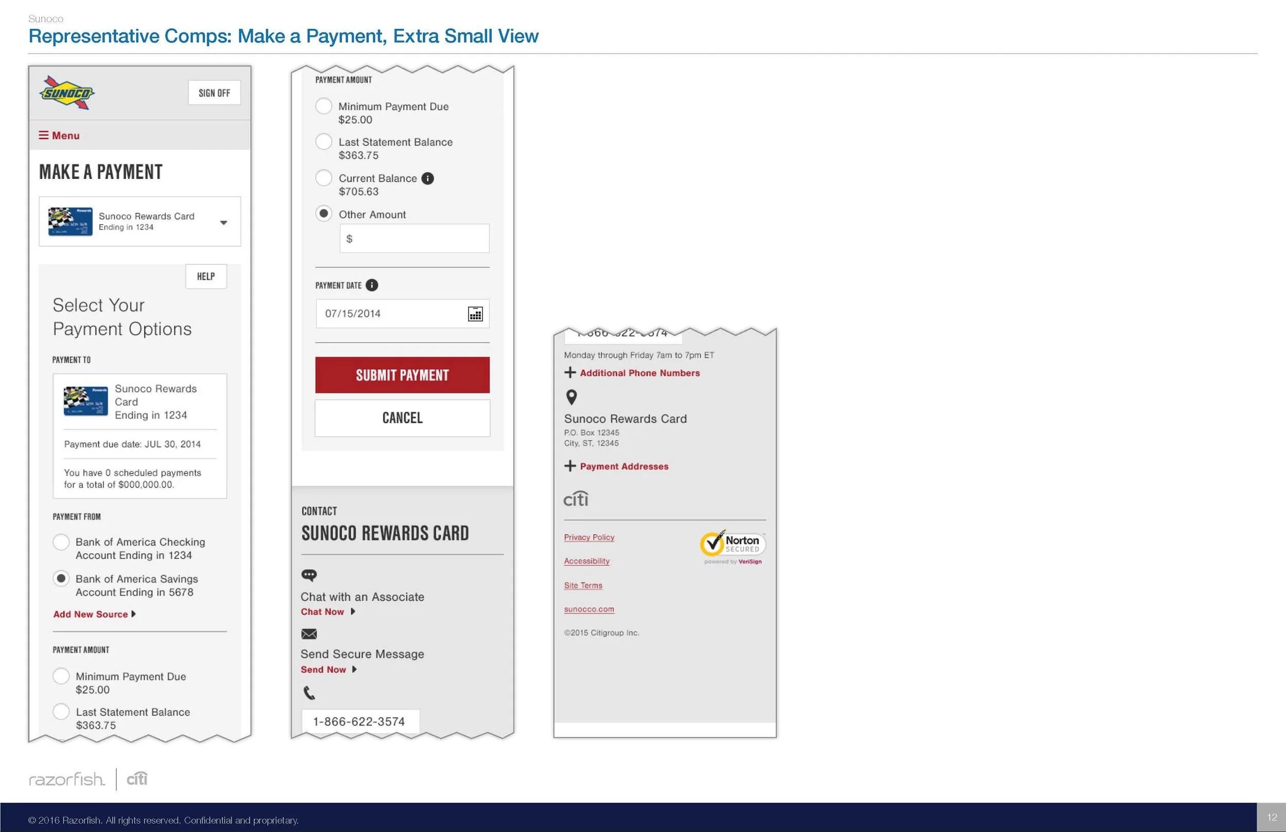
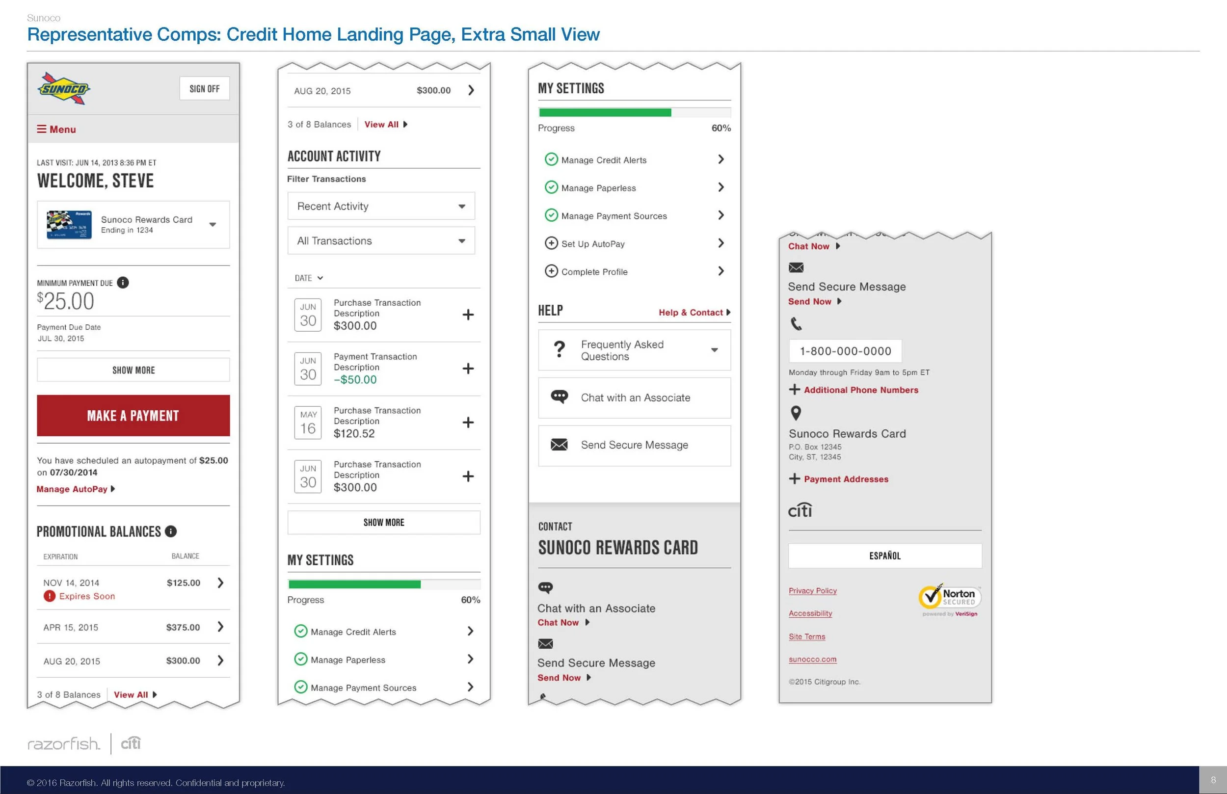
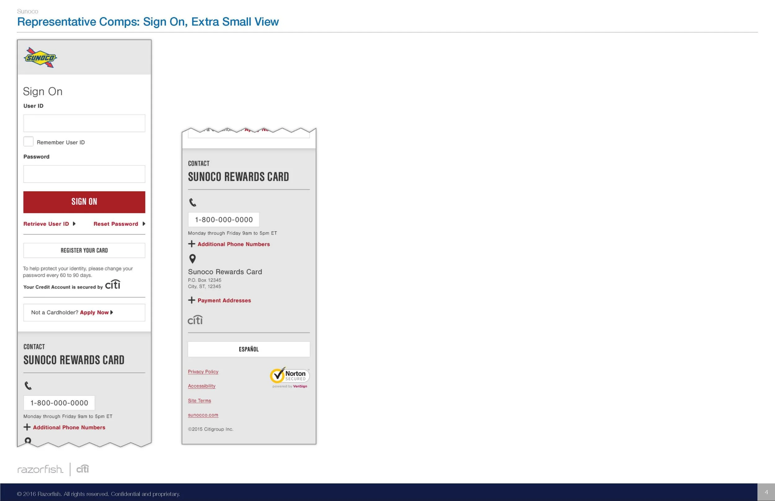
The modular framework was a key building block to the Fusion experience. Components were built and tested at the global level. This was done to increase speed to market, established consistent best in class functionality across all partners, and reduced cost of ownership and maintenance.
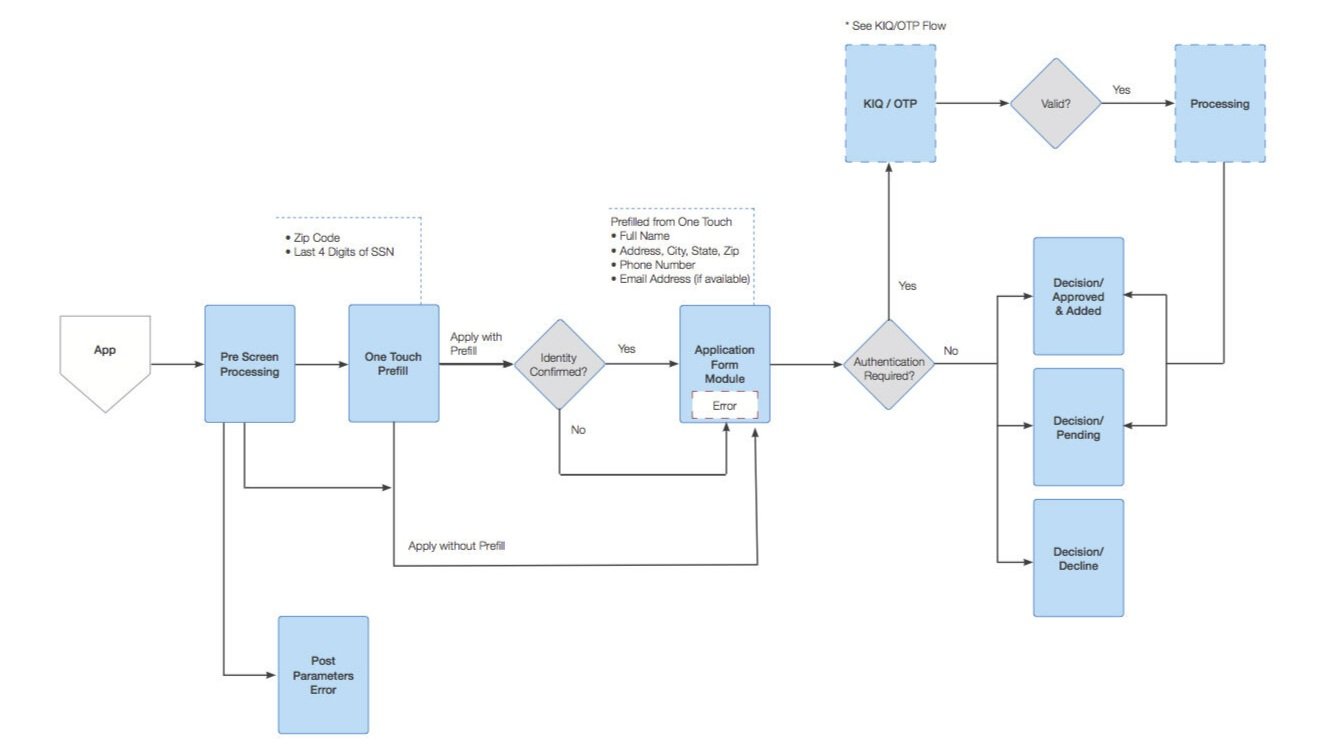
User Flows
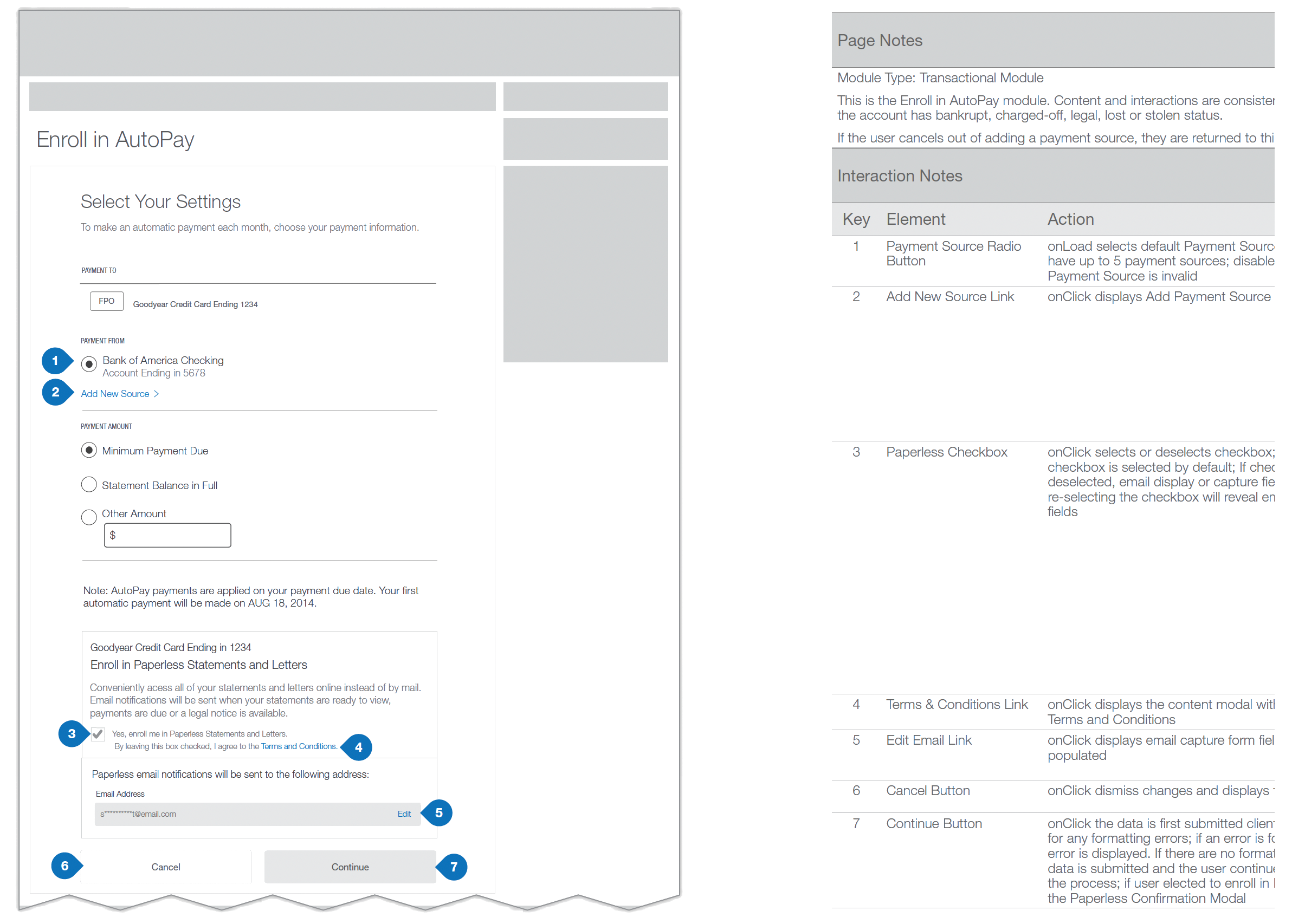
Wireframes
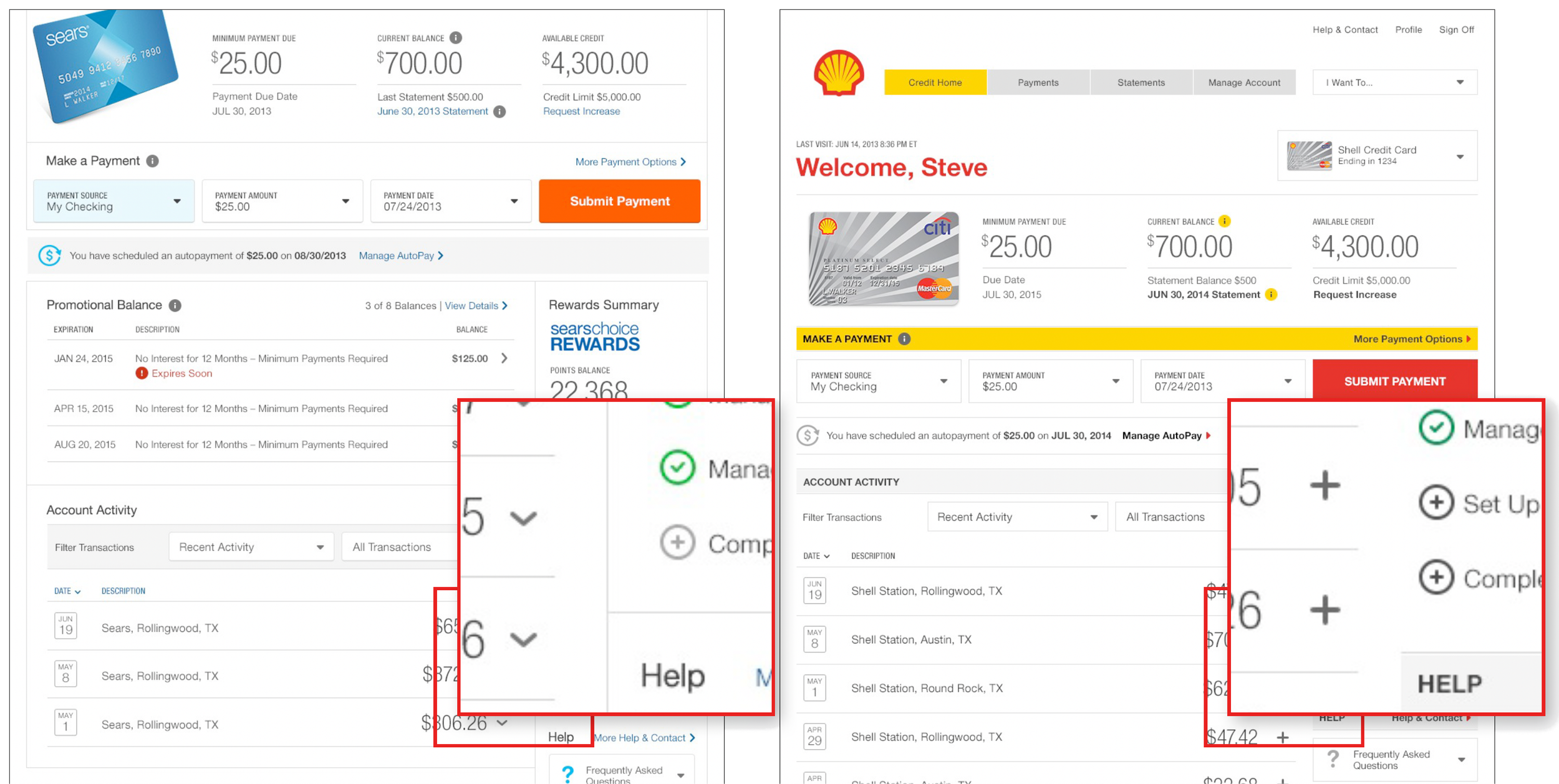
Modular Styles
Component Layout
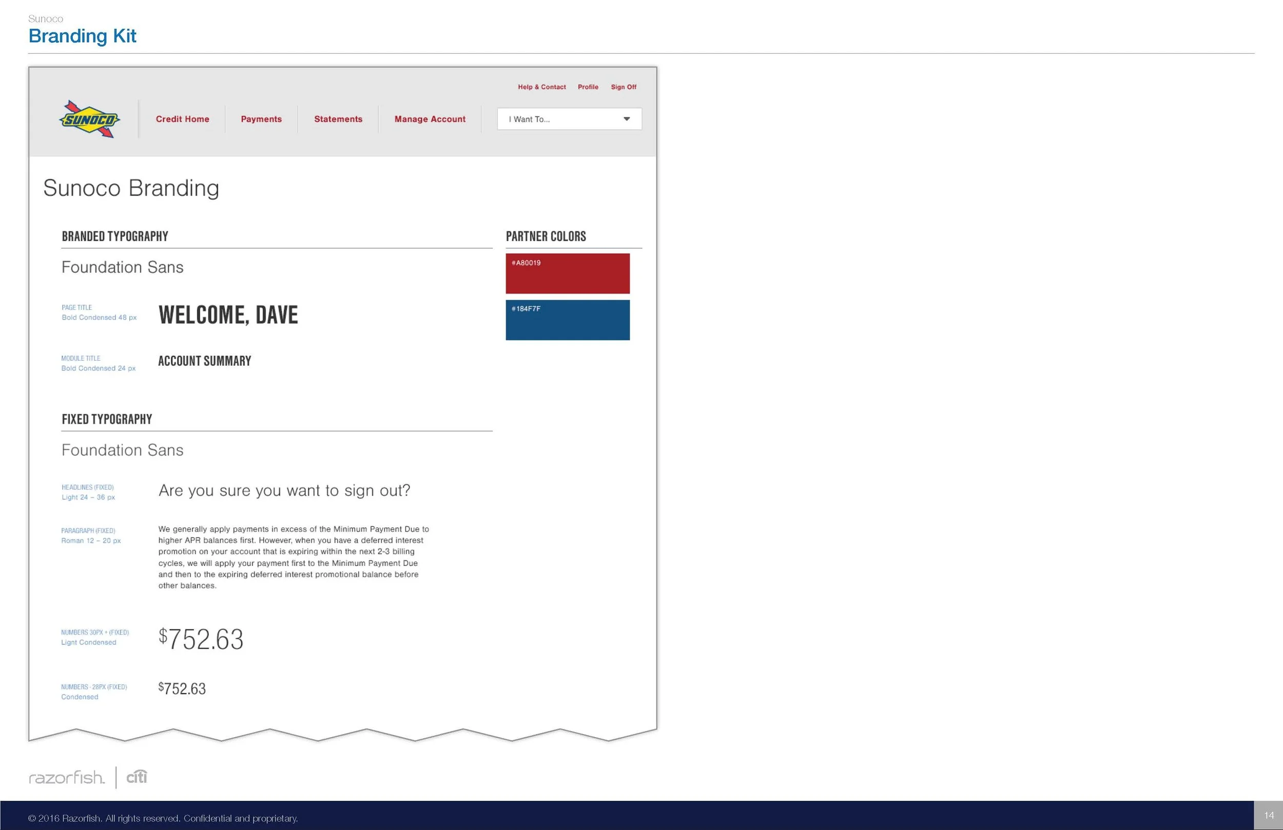
Font Styles
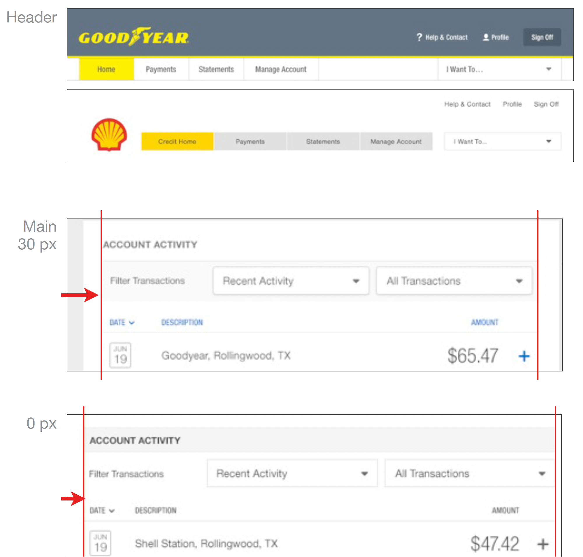
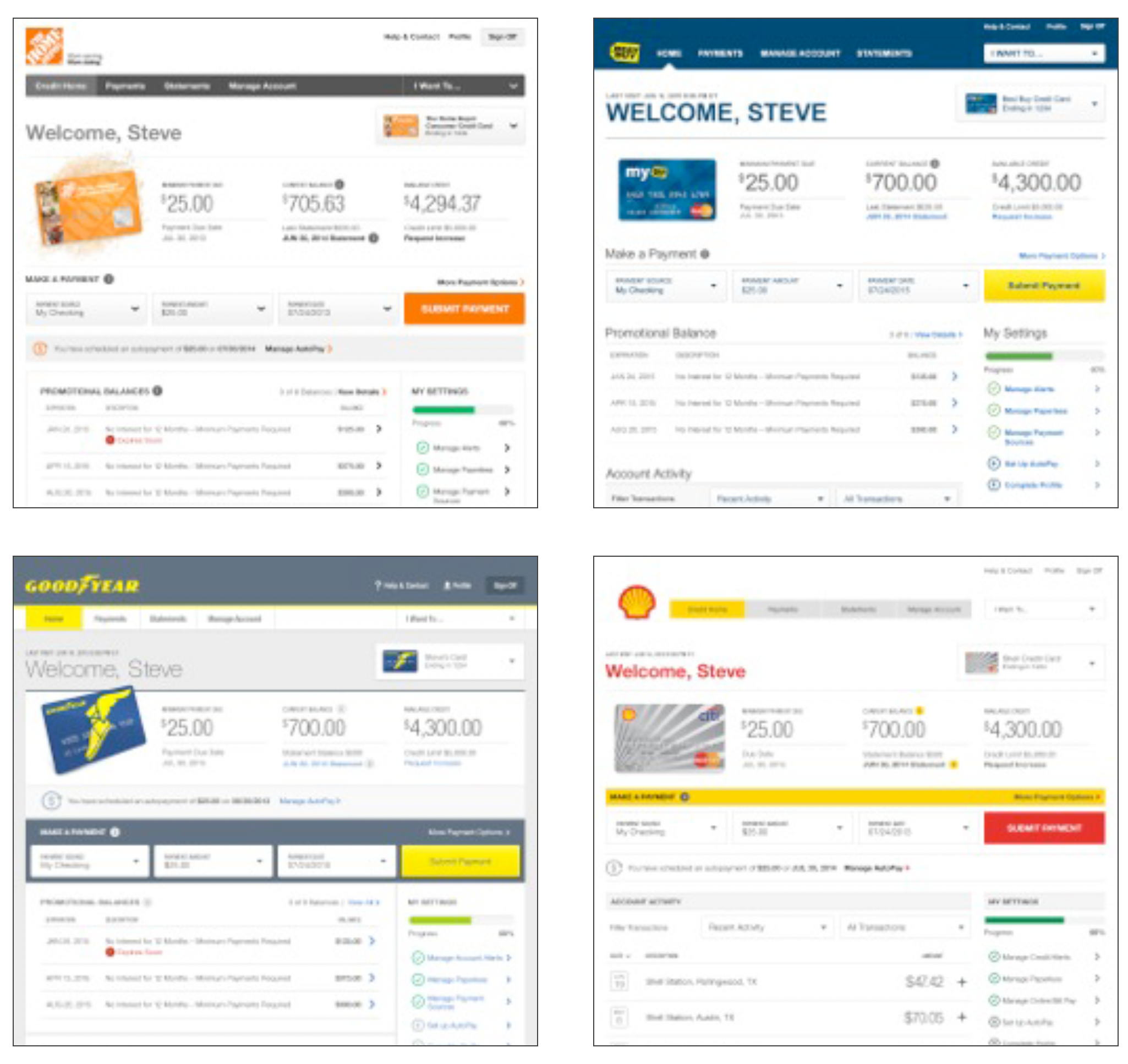
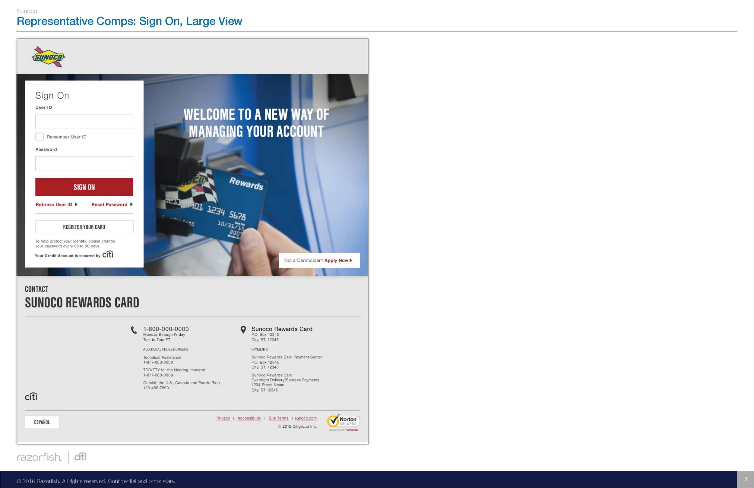
Color could also be applied to various elements across the design system to distinguish the individual brands.
Branded Elements
Masthead
Page background
Module background
Title bar
Buttons
Links
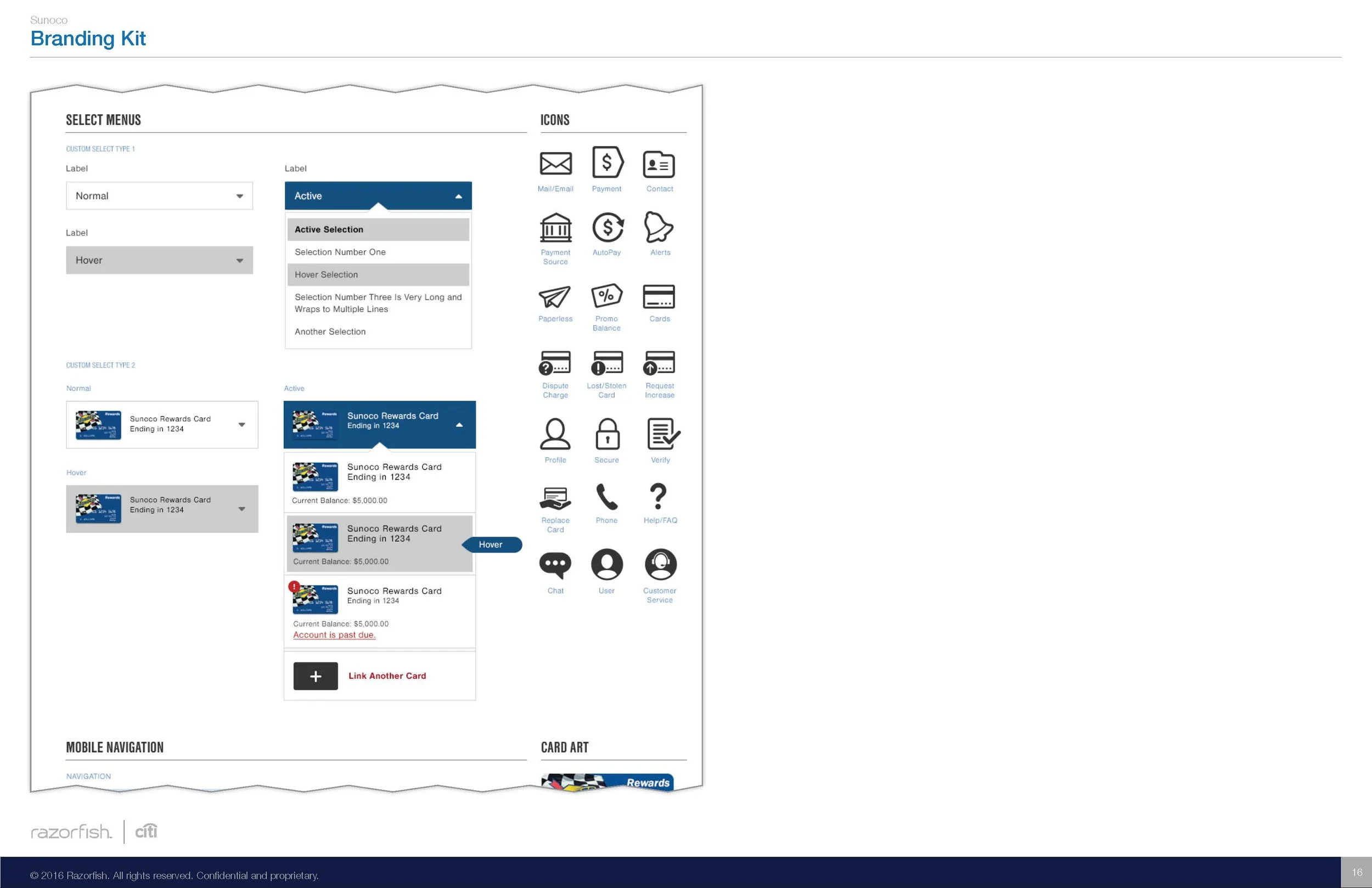
Icons
Tool tips
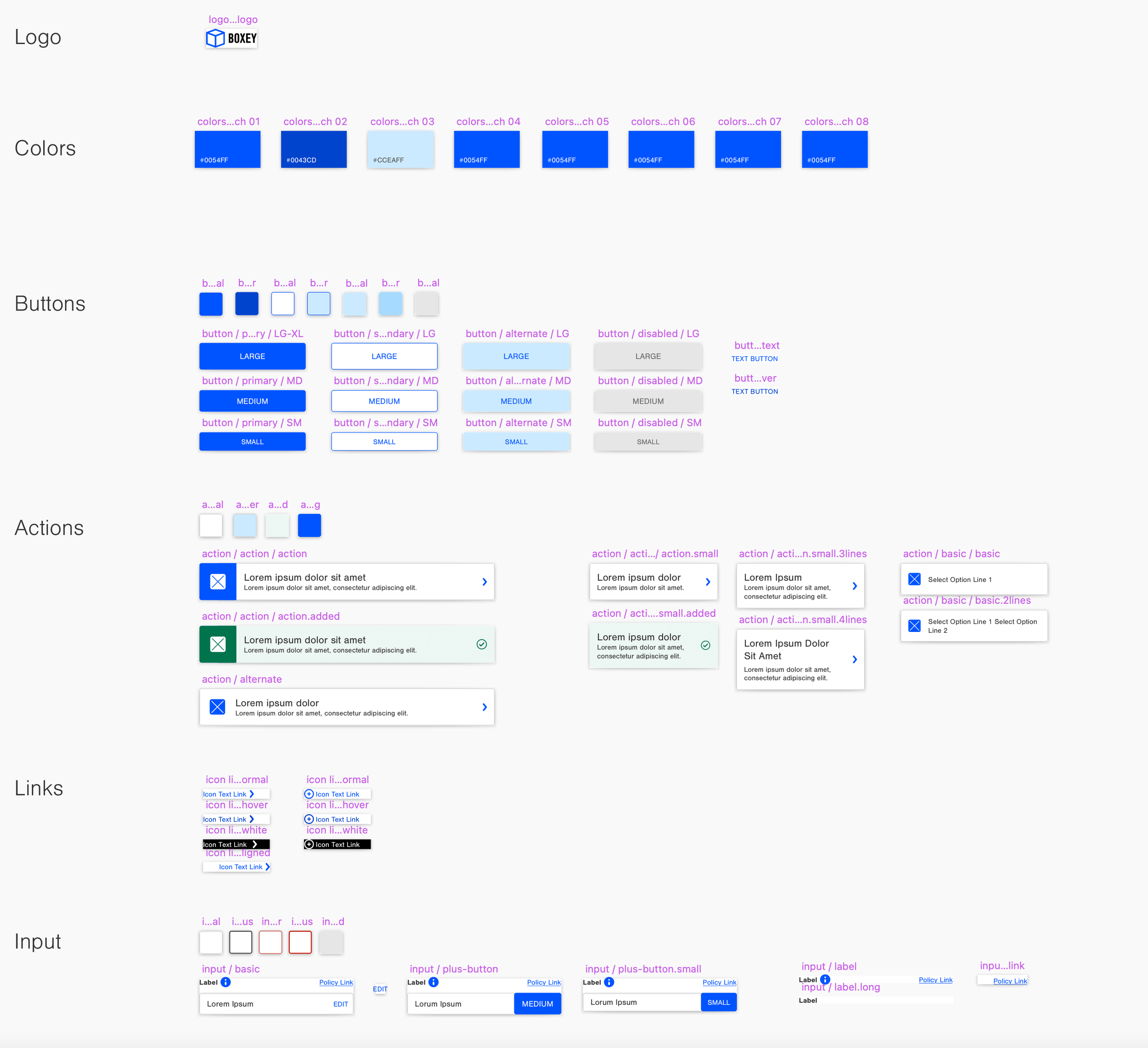
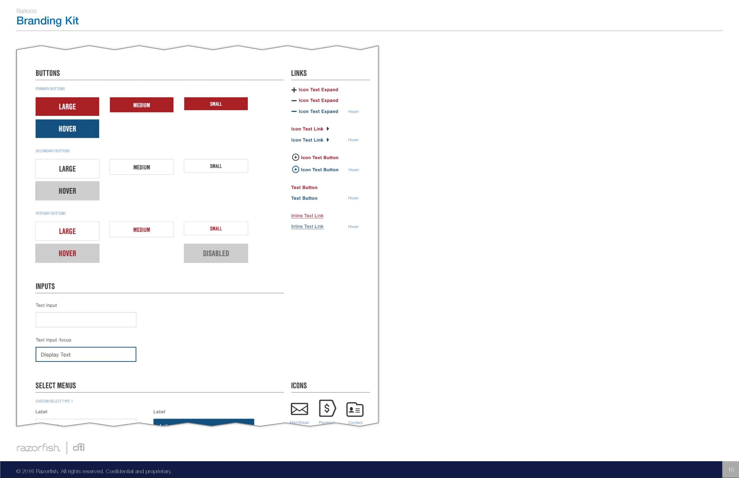
Button Styles
Fusion has three button types—primary, secondary, and tertiary. Each type was available in small, medium, and large sizes.
The button styles could be shaped, colored, and have their type faces and padding modified to best reflect the partner brand.
Summary
Module Styles: Padding between modules, as well as the use of a border around the module
Module Layout: Position of content inside of the module
Forms Styles: Styling of input fields and select menus
Button Styles: Shape of the buttons – square or rounded
corners and decoration, including bevel or stroke
Font Styles: The weight, case, size, and color of specified page titles, buttons, and link text
Color: Overall color palette applied to the site – including page background, masthead, modules, and buttons

