HELOC APPLICATION
Prosper Financial
The Business
Prosper Financial is a small privately-held fintech company specializing in peer-to-peer loans.
The Ask
My assignment was to redesign the existing HELOC (Home Equity Line of Credit) application and improve conversion rates through user education and transparency. I was the design lead on this project with access to the company’s dedicated researcher and the Executive Creative Director for feedback and in-sites.
My Role
As the sole designer on this product, I decided to:
Review the existing flow and design
Review the existing research to understand user needs
Craft a design strategy
Develop a concept and wireframes to communicate my strategy
Update the design to reflect the most recent iteration of Prosper’s design system
Make detailed design comps and a prototype for testing
Test the prototype in new rounds of usability testing
Iterate further on designs, then retest
Prepared detailed design comps for delivery to the in-house development team
I STARTED BY:
Examining the Existing User Journey
1.
The user arrives on the site from an online ad or through Google Search.
2.
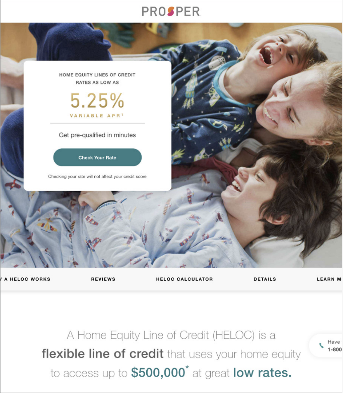
The user lands on the campaign page and sees an attractive interest rate and positive brand messaging.
3.
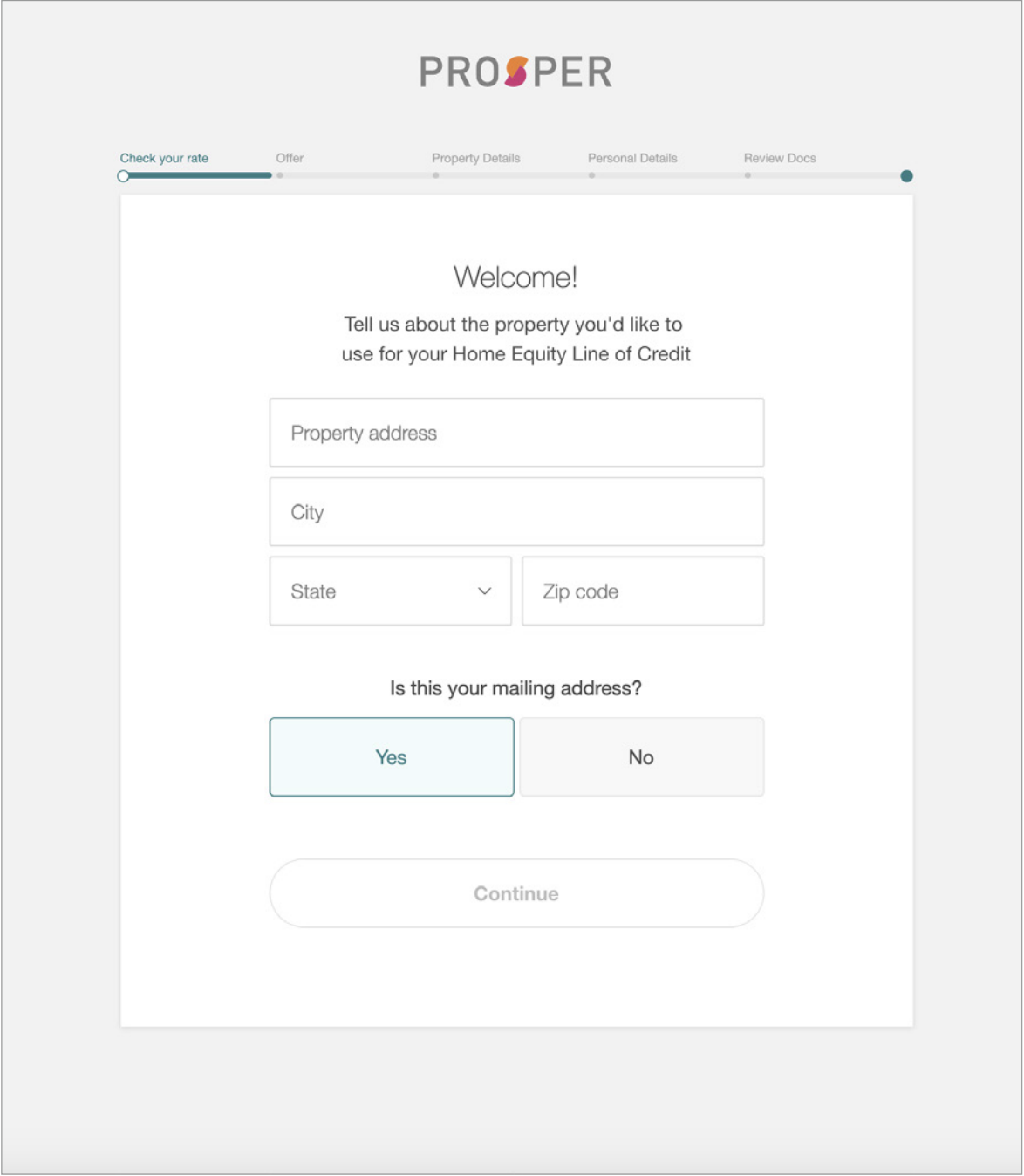
The user enters their basic personal information, accepts the terms of service, and allows a soft credit pull.
4.
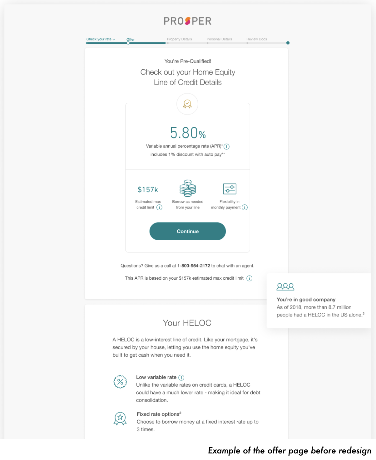
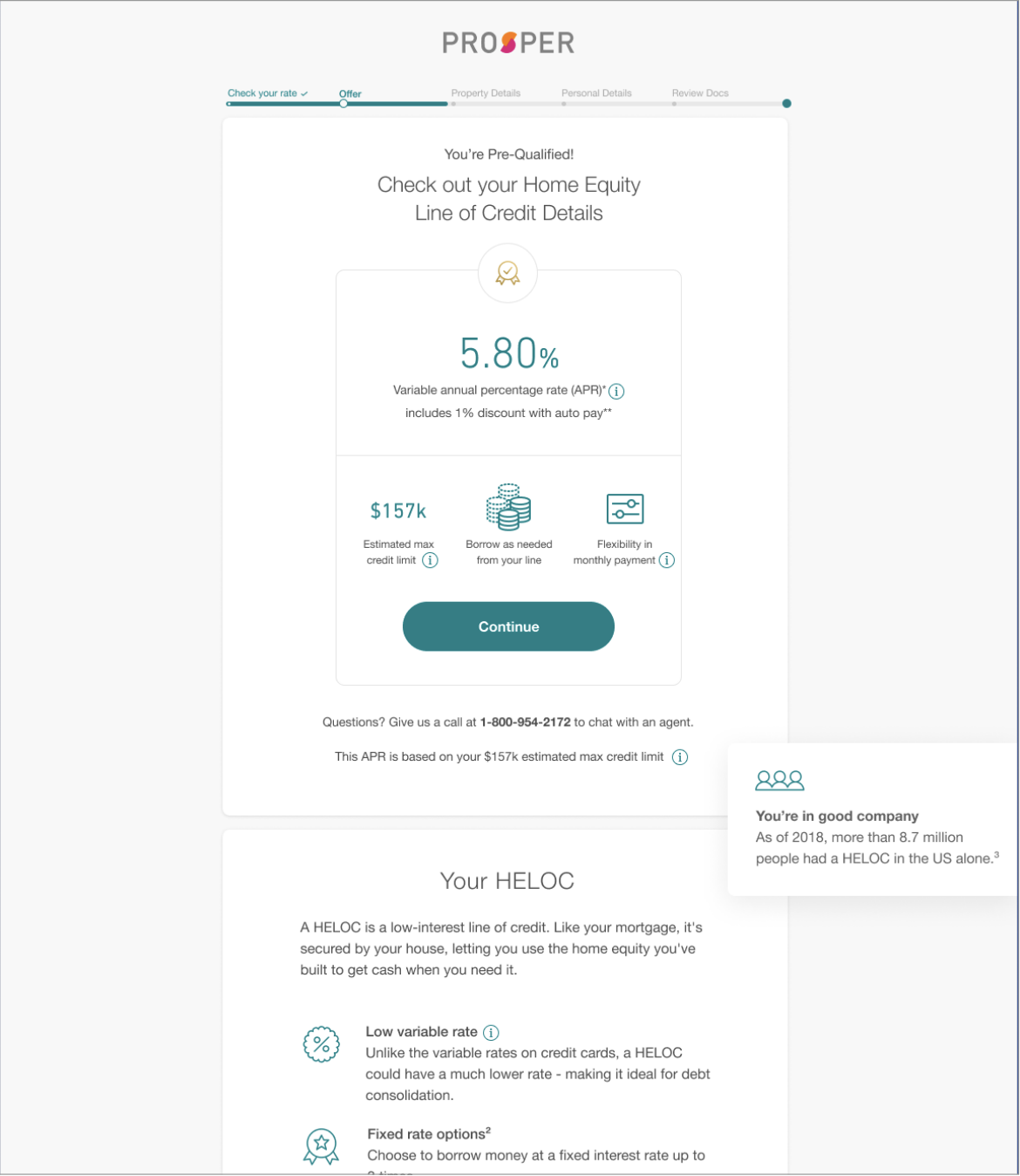
The user lands on the HELOC offer page to be redesigned.
5.
After the user accepts the HELOC offer, they begin the Confirmation Flow where they enter their financial information and employment history. Finally, they review and submit their information, then await a response.
Reviewing Existing Research
My Findings
Users had questions about the repayment requirements
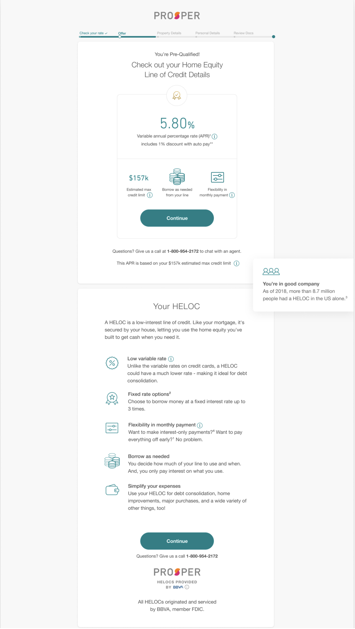
People thought the page was too long
The page contained repeating information
A majority of users didn’t understand the differences between a HELOC and a traditional loan
My questions
How do we explain complex financial ideas in simple and clear ways, so users feel more empowered to make the best choices for them?
How do we help people understand the financial constraints—how can we help people calculate what their monthly payment will be?
My notes
The current design does not meet accessiblity standards, make sure new designs are WCAG 2.1 compliant.
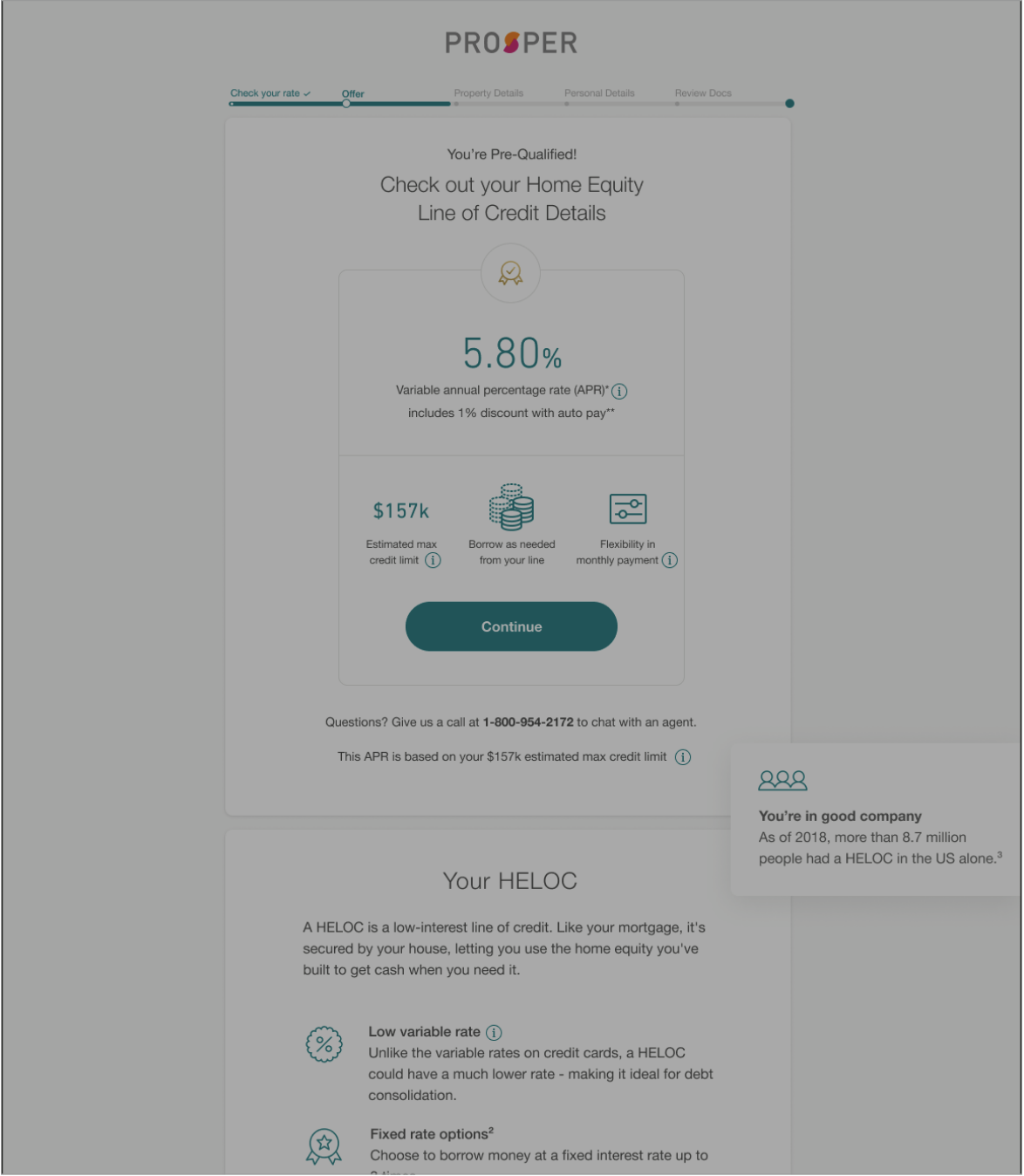
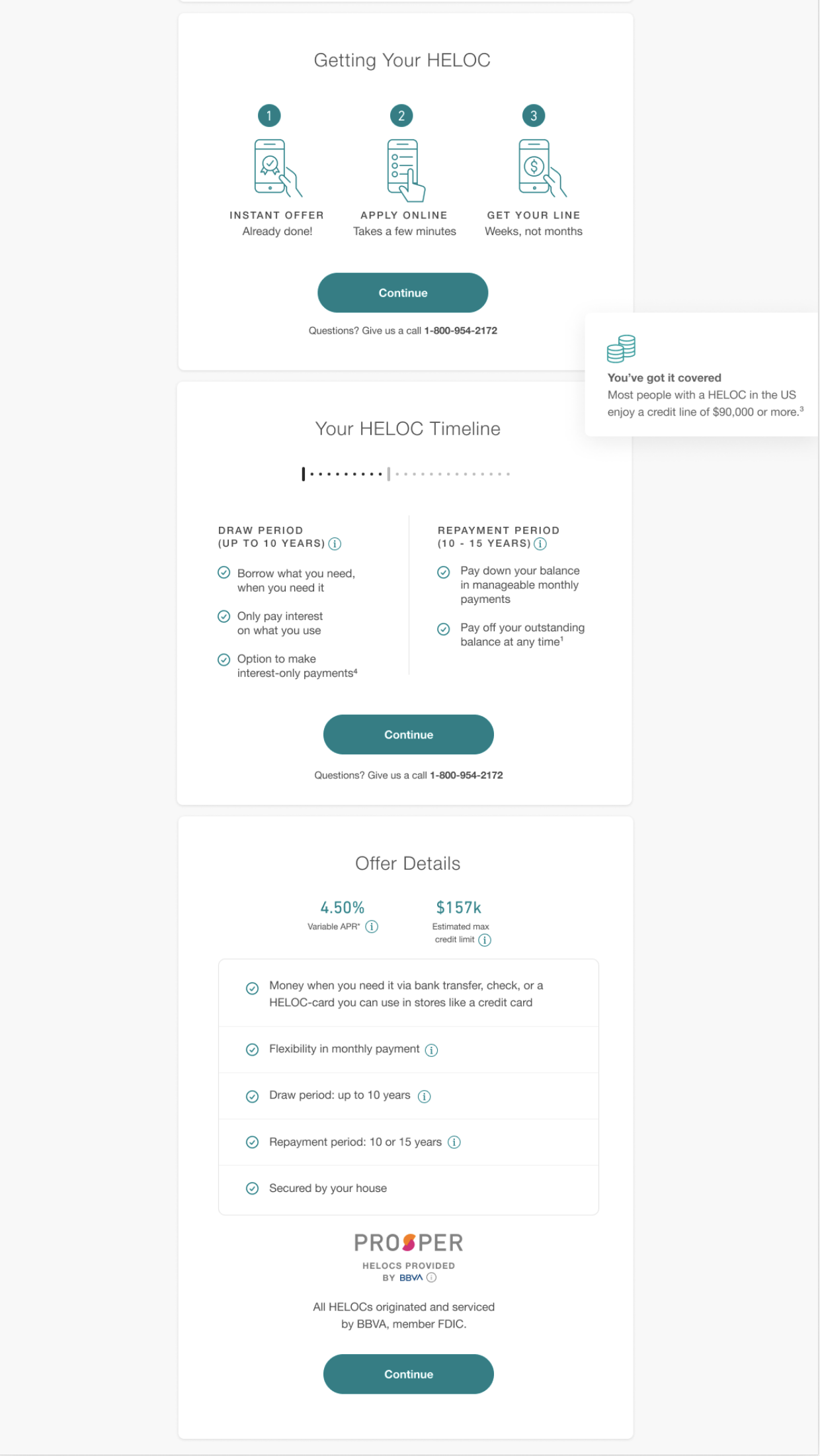
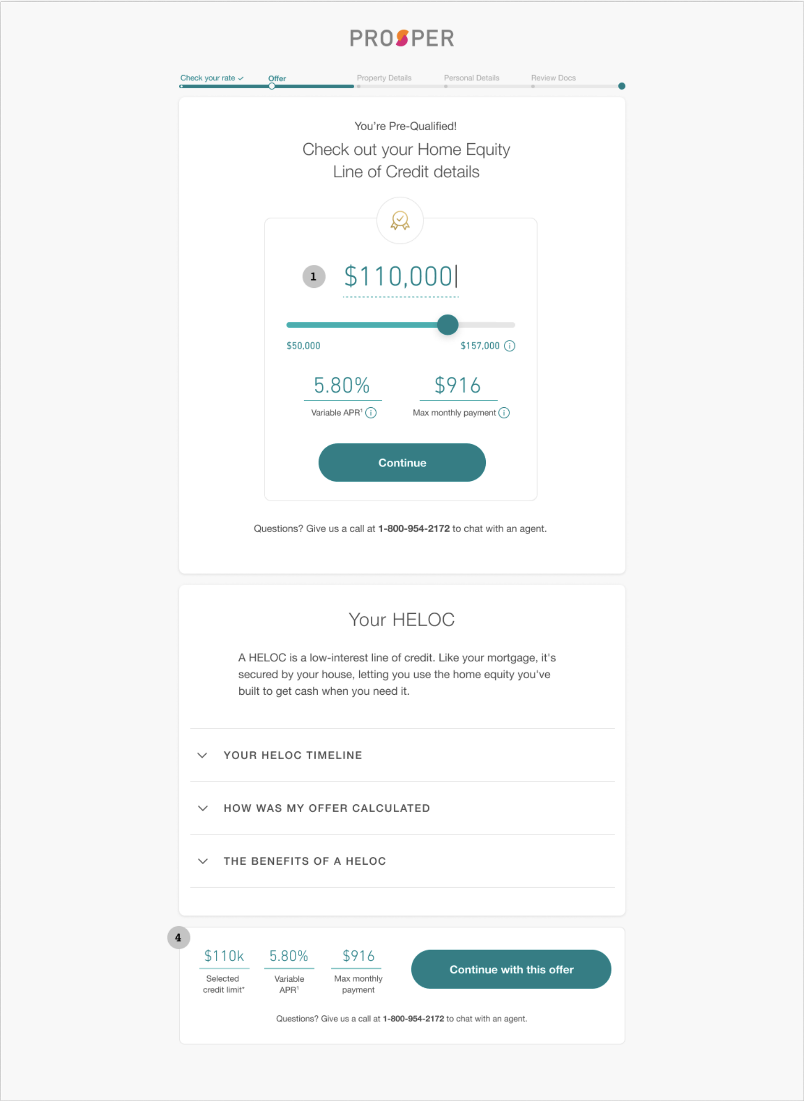
Reviewing the existing HELOC flow.
My observations
Strong visual elements support the task:
Consistent use of large CTA buttons helps keep things moving
Iconography supports the written content
Nice to find “hover content,” but uncertain how successful it is in answering user questions or whether it’s accessible for everyone on mobile
Copy has a friendly tone but it isn’t consistently deployed throughout the content
Seemingly irrelevant and repeating information on the current page
Without prior knowledge, I wouldn’t feel confident in the information presented on the page and would be unlikely to continue the application
Unclear how and why an offer was calculated
Repayment requirements are confusing
Overall, the offer feels too long in what is already a long application flow
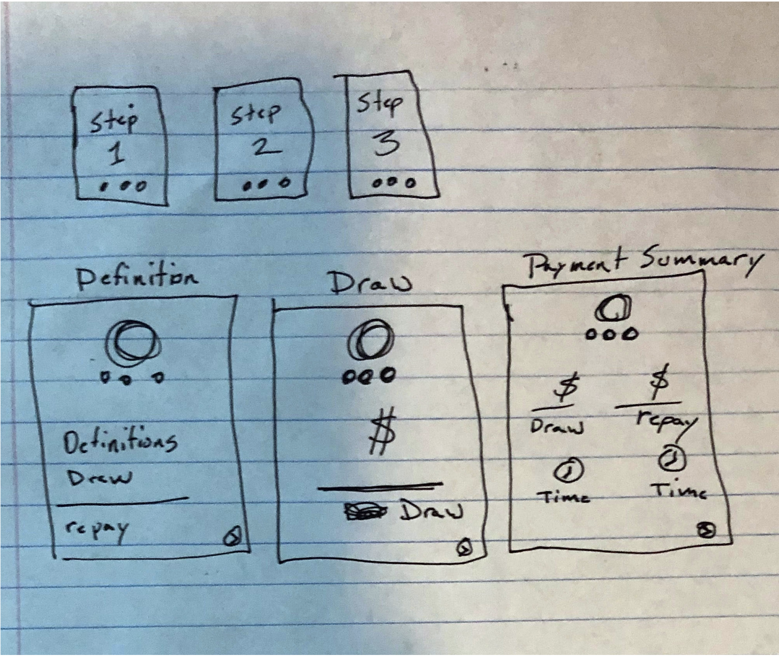
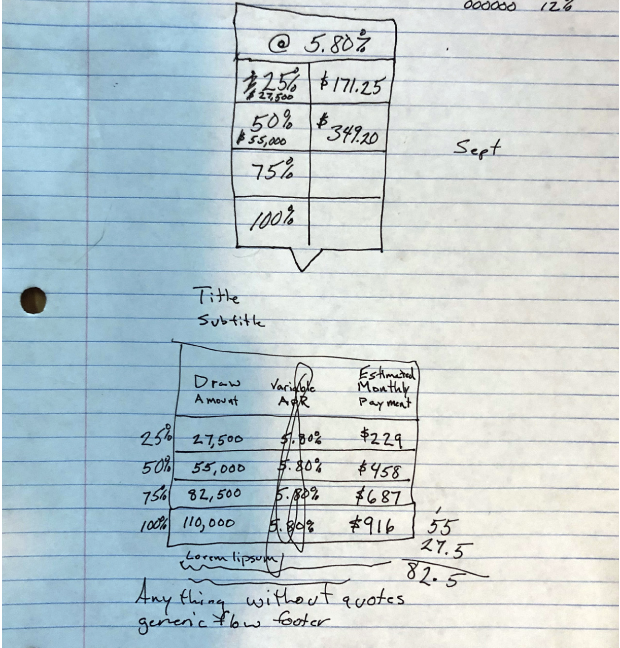
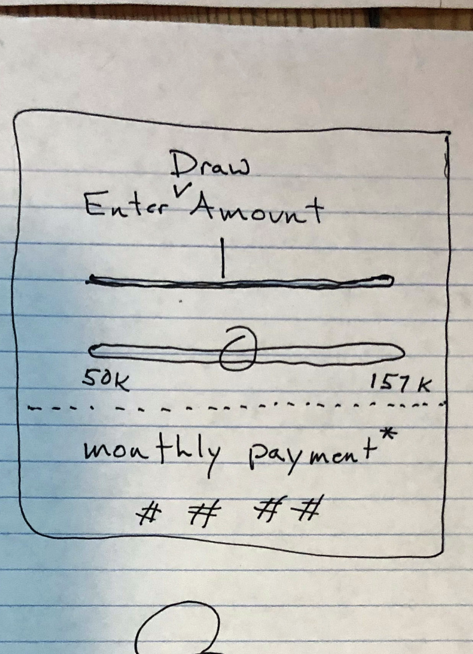
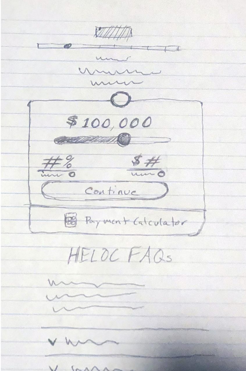
Low-fidelity wireframes.
Here are examples of a few low-fidelity sketches that allowed me to quickly see what was and was not communicating the necessary information to users.
Prototype in Figma
Met with the product manager and lead developer to discuss feasibility
I made the comps in Figma using the existing grid and design elements
I updated the existing palette to be accessible by increasing the contrast ratios as slightly as possible to maintain the existing look and feel while also passing WCAG 2.0 accessibility requirements
I used as many existing library elements as possible, such as icons, buttons
I also had to track down some existing elements on the site and recreate them in Figma to ensure brand consistency, such as the FAQ accordions and the formatting of info bubbles
Next, I built a functional click-through end-to-end prototype in Figma
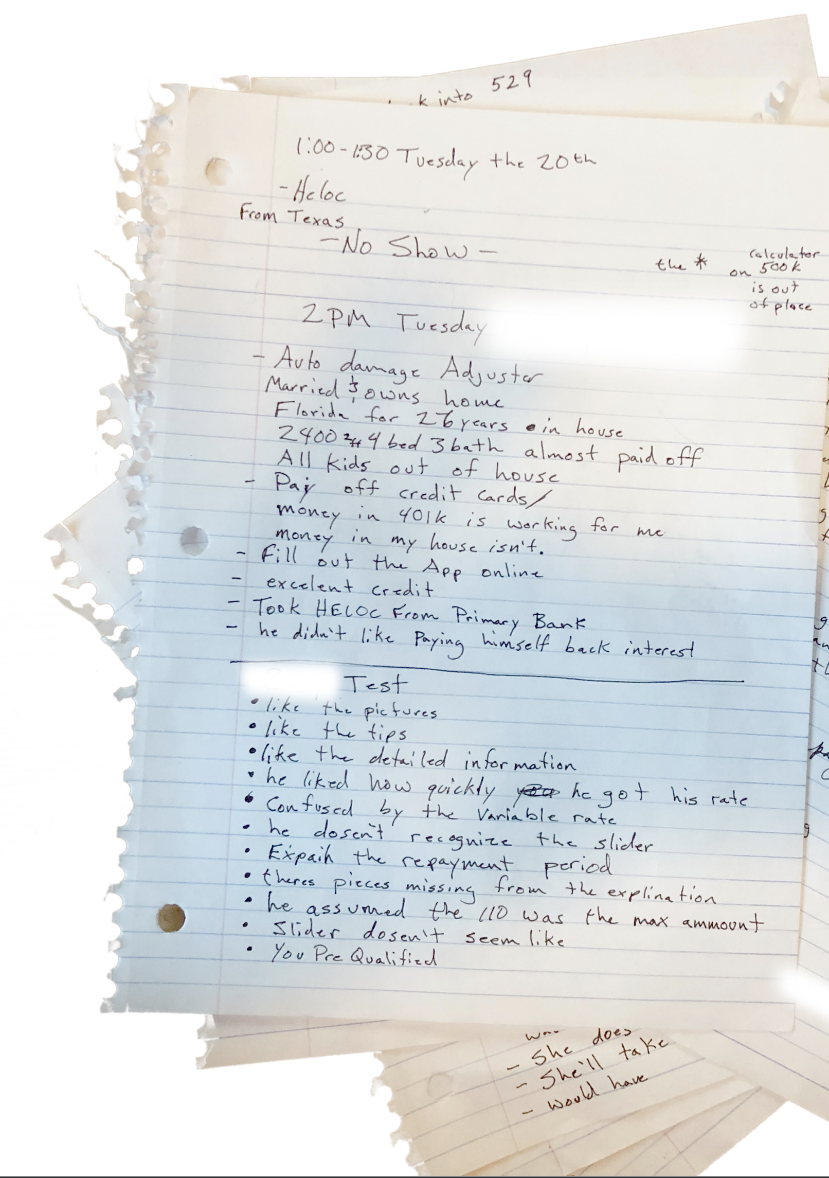
Ran prototype through usability testing.
Over several days of testing, I made design iterations to the prototype (mostly content-related).
Key findings
The APR was less important to people than the monthly payment amount
Users thought the FAQs and tool-tips were useful and provided good customer service
Debt consolidation and home improvement were the main motivations to apply
Users wanted a payment calculator based on the draw amount, rather than a line-of-credit amount
In the future, we should anticipate that users will have multiple offers from up to 5 different brokers and/or banks to choose from

